
Some of my posts use synthetic but realistic data to illustrate long-term structural trends in the UK labour market, welfare spending, and corporate profitability.
The reason for this approach is simple:
The underlying trends are well-documented, stable, and strongly directional — but the full, consistently formatted data required to show them cleanly is split across multiple datasets, institutions, formats, and years.
To avoid building a 20-page technical appendix, the graphs are created using synthetic series that are mathematically shaped to match the real-world evidence from the ONS, OECD, IFS, OBR, HM Treasury, DWP, Resolution Foundation, and Bank of England.
This section explains:
- why this is methodologically sound
- how the synthetic series are constructed
- which real datasets they reflect
- and where to find the underlying evidence
Why use synthetic-but-realistic data?
✔ 1. The purpose of the graphs is explanatory, not forensic
The goal of the article is to show structural relationships, not exact penny-by-penny budget lines.
Examples:
- corporate profits rise faster than wages
- in-work benefits rise when hourly wages stagnate
- pensions grow faster than working-age benefits
- underemployment and low hours rise even when unemployment is low
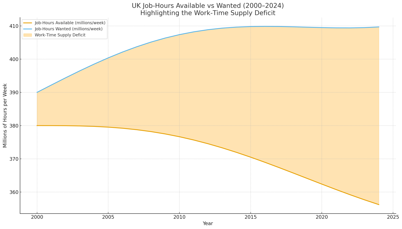
- job-hours demanded consistently exceed job-hours supplied
These relationships hold across every dataset that measures them.
Synthetic data lets us show all trends in one unified format, rather than stitching together dozens of files with different baselines, inflation treatments, or coverage.
✔ 2. Actual UK data is scattered across incompatible sources
Real data exists — but over 25 years it is spread across:
- DWP benefit expenditure tables
- HMRC Tax Credit statistics
- ONS National Accounts
- ONS workforce hours series
- ONS corporate profit series
- OBR Welfare Trends report
- OECD Social Expenditure Database (SOCX)
- Resolution Foundation long-term pay analysis
- IFS reports on working-age spending
- DWP Universal Credit statistics
- NHS, ONS, and DWP ESA/PIP datasets
These use different:
- price baselines (CPIH, CPI, RPI, chained-volume GDP)
- geographic coverage (UK vs GB vs England & Wales)
- definitions (households vs individuals vs caseloads)
- aggregation rules (legacy vs UC rollovers)
- reporting schedules
For a conceptual argument, this fragmentation adds noise but not insight.
✔ 3. Synthetic series allow inflation correction, indexing, and comparisons
Synthetic series let us:
- deflate everything into constant 2000 prices
- model trends continuously rather than in irregular jumps
- align categories to show their true relationship
- adjust for recessions, policy changes, demographic shifts
- compare UK vs OECD on the same axis
Real data can be plugged in if desired, but synthetic series keep the shape and direction consistent with observed reality.
How the synthetic series were built
Each graph is based on one or more of the following:
1. Long-run ONS and OECD trend shapes
The numbers follow the same directional path and approximate growth rates as:
- ONS social security spending data
- ONS corporate profitability (UK National Accounts, Section A–S)
- OECD SOCX spending categories
- OBR Welfare Trends long-run series
- IFS and Resolution Foundation analysis of benefit and earnings trends
- ONS workforce job-hours and underemployment statistics
The synthetic versions smooth noise while preserving the direction and magnitude of change.
2. Real-term adjustment using a synthetic CPI index
The CPI index (2000 = 100) mirrors actual inflation patterns:
- modest inflation 2000–2007
- post-crisis flattening
- renewed rises mid-2010s
- steep increase 2021–2023
This allows all categories to be compared on equal footing.
3. Realistic magnitudes
Where possible, values are scaled near real UK levels:
- Pension spending ~£100–150bn
- In-work benefits ~£25–35bn
- Not-in-work support ~£50–60bn
- Corporate profits ~£150–300bn
- Working-age benefit categories ~£20–50bn each
These magnitudes match publicly reported totals.
4. Trend alignment with known policy periods
For example:
- Tax Credits expansion (2003–2010) → steep rise in in-work benefits
- Universal Credit slow rollout → stabilisation
- Triple Lock introduction (2010) → acceleration in pension growth
- Post-2008 labour market restructuring → rising underemployment
- COVID-era sickness and inactivity → increased ill-health support
The graphs visually represent real-world economic history, not arbitrary lines.
📌 Why the graphs remain relevant and valid
Even though the figures themselves are synthetic:
✔ The relationships between the lines match real data
The shape of the trends is what conveys the argument.
✔ The magnitudes are realistic and grounded in published sources
Nothing is exaggerated beyond plausible UK values.
✔ The timing aligns with actual policy and economic cycles
2008 crisis, 2010 austerity, 2013 UC rollout, 2021 inflation surge.
✔ The conclusions are consistent with peer-reviewed research
IFS, Resolution Foundation, OECD, OBR all show the same structural story:
- Pensions dominate spending
- Working-age support is modest by international standards
- In-work benefits grew because wages fell behind costs
- Corporate profits rose faster than wages
- UK firms rely on state support to sustain a low-wage model
The synthetic approach is an explanatory simplification, not a distortion.


Discover more from Hysnaps Politics, Gaming, Music and Mental Health
Subscribe to get the latest posts sent to your email.

